Timeline
Feb – Oct 2016
(Multiple Sprints & Multiple Stories and Touchpoints)
Platform
Web, Android, iOS
Team
Assoc. Designer
Note: This was really long project and spanned several
months. There were many iterations contributed by both
me and Krishna (the design lead) so I've edited down
the project in retrospect and carefully mentioned in
what ways I contributed. This project, like many others
during my time at Hopscotch, was about strategically
working together within the team, learning from every
subsequent release and improving the experience with
each iteration.
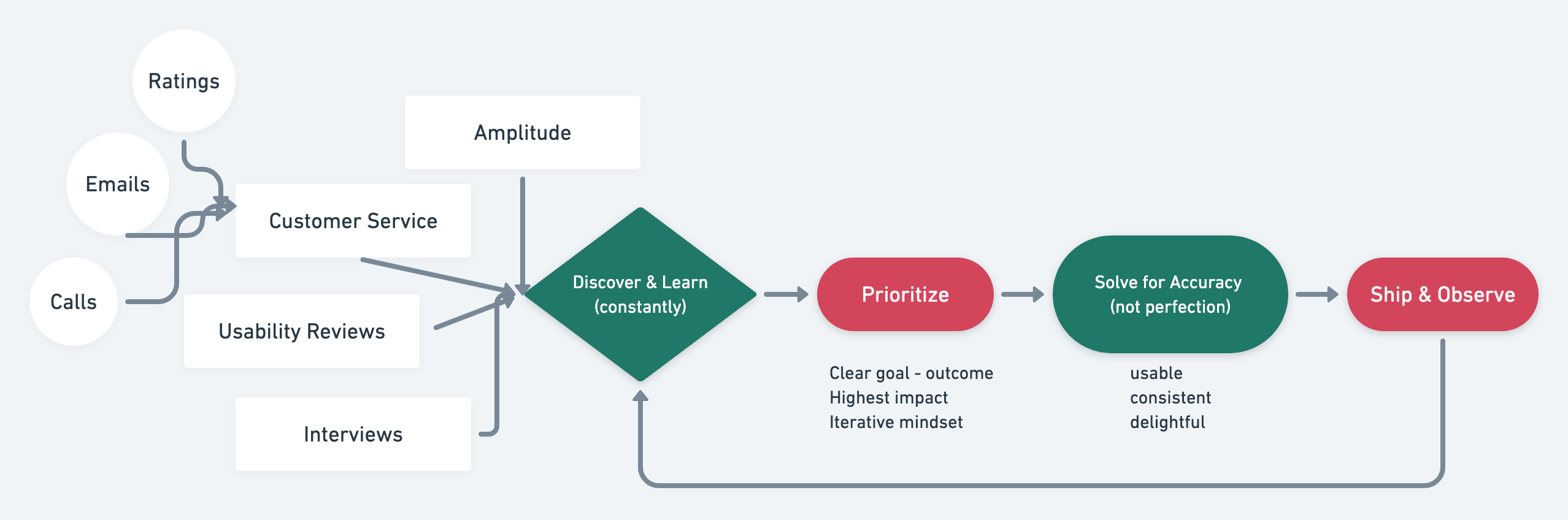
The Process
As this project spanned several months and involved designing for multiple platforms, we obviously didn’t follow a linear process but here’s how things usually feed into and exit our sprint-based design team operations (and this project was no exception)
The Problem
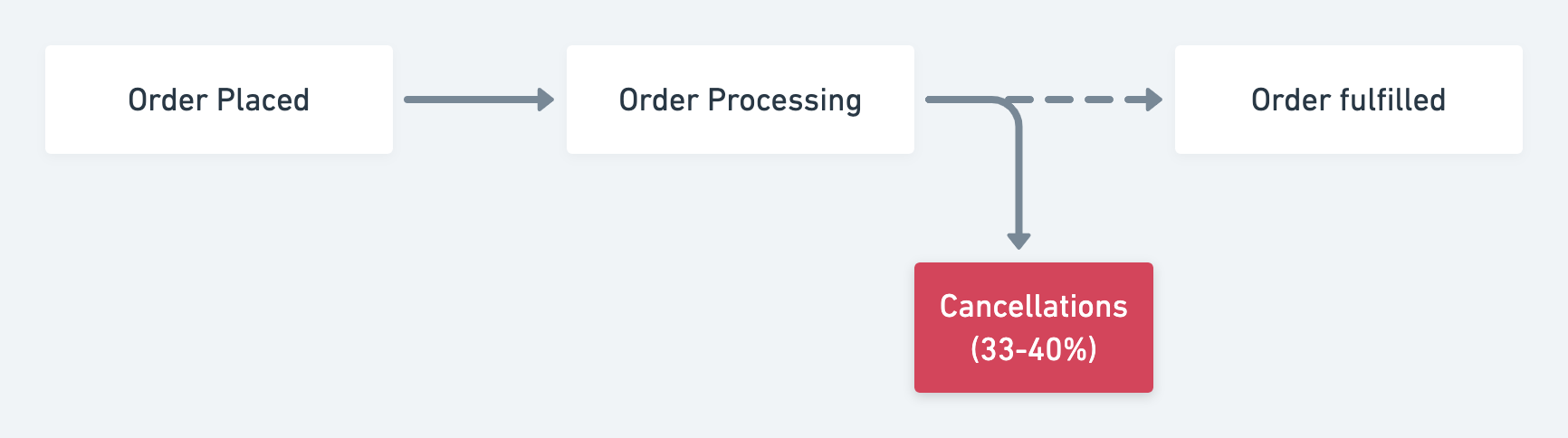
After launching our ambitious redesign Hopscotch 2.0, we started delving deeper into the customer experience beyond the browsing and buying experience by gearing up to tackle the next big problem after acquiring new buyers – order cancellations. It can be understood better by observing the emotional low points in a typical new buyer’s first purchase on our platform as seen below –

What we learned
Cancellations in our business was particular high due to the following well understood factors –
- Over 80% of our inventory is pre-order which means it takes a 3-9 weeks to ship depending on where it’s coming from and arragements with the vendor. This detail was often missed by new buyers.
- Given the prevalent mental model of fast delivery which our customers were used to because of competitors like Amazon, Flipkart and others, they were often surprised at why orders took so long to deliver.
- The misunderstanding about order timelines meant huge pressure on our customer service team due to high call volumes, wait times and cost.
- All these factors translated into low confidence in our brand and was leading to all time high order cancellations especially from New Buyers.
As a growing business investing heavily in supporting more vendors and marketing to increasingly demanding customers, the high cancellation rate was creating a huge dent in profitability. We had to act fast.
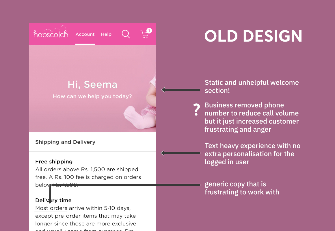
Issues with the existing system
I’ve tried to illustrate the major findings from the project in the form of annotated screenshots but this by no means is an exhaustive representation of our understanding of the problem nor the goals and intentions behind the redesign.
After careful analysis of the problem we located two pain points responsible for more of the cancellation requests –
- The shipment section in the order details page
- The static help / customer service page

With the new design we wanted to achieve two things, tackle these glaring issues that kept call volumes high while also extending our redesigned Web 2.0 visual language to these product experiences.
Moving from Understanding to Response
Here we explored how design can help product step back from writing software requirements to start thinking in terms of scenarios and job to be done so that it opens up multiple ways of addressing the underlying problems and commit to a longer project with multiple planned interventions over time.

The Improved Design
Presenting the annotated redesigns of the major touchpoints we reworked.
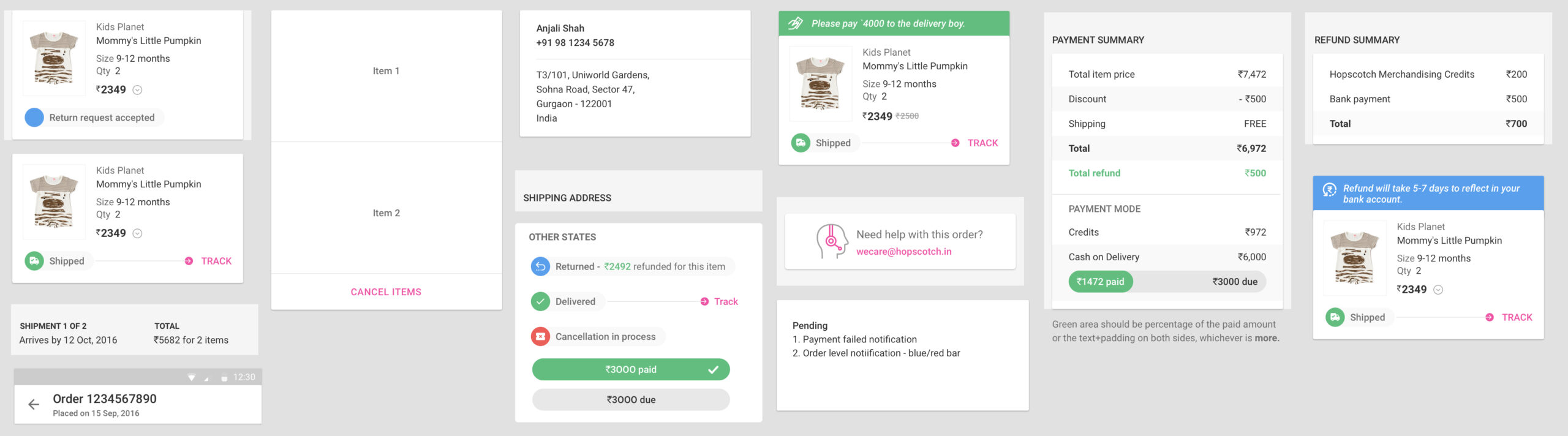
The New Order Details Page
The order details page is an extremely complex set of components that have multiple states and scenarios. Presenting some highlights of the improvements done.


Here’s a sneak peak of the UI component library we created and maintained for this project. While the mockups provide an overview of the design, these libraries are what makes developing the UI a breeze for our developers. Being a former front-end developer myself, I was very meticulous about design documentation.
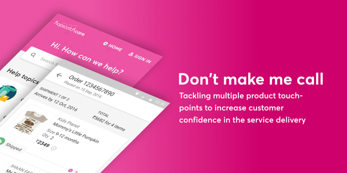
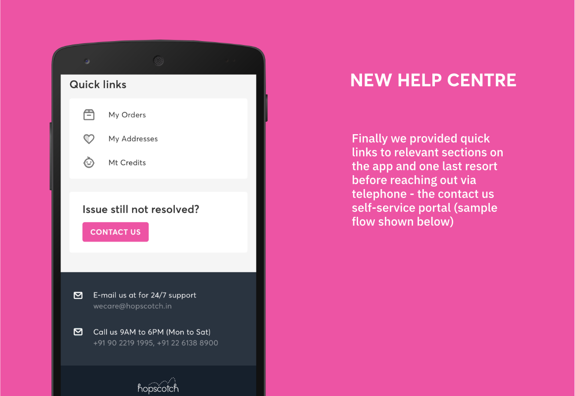
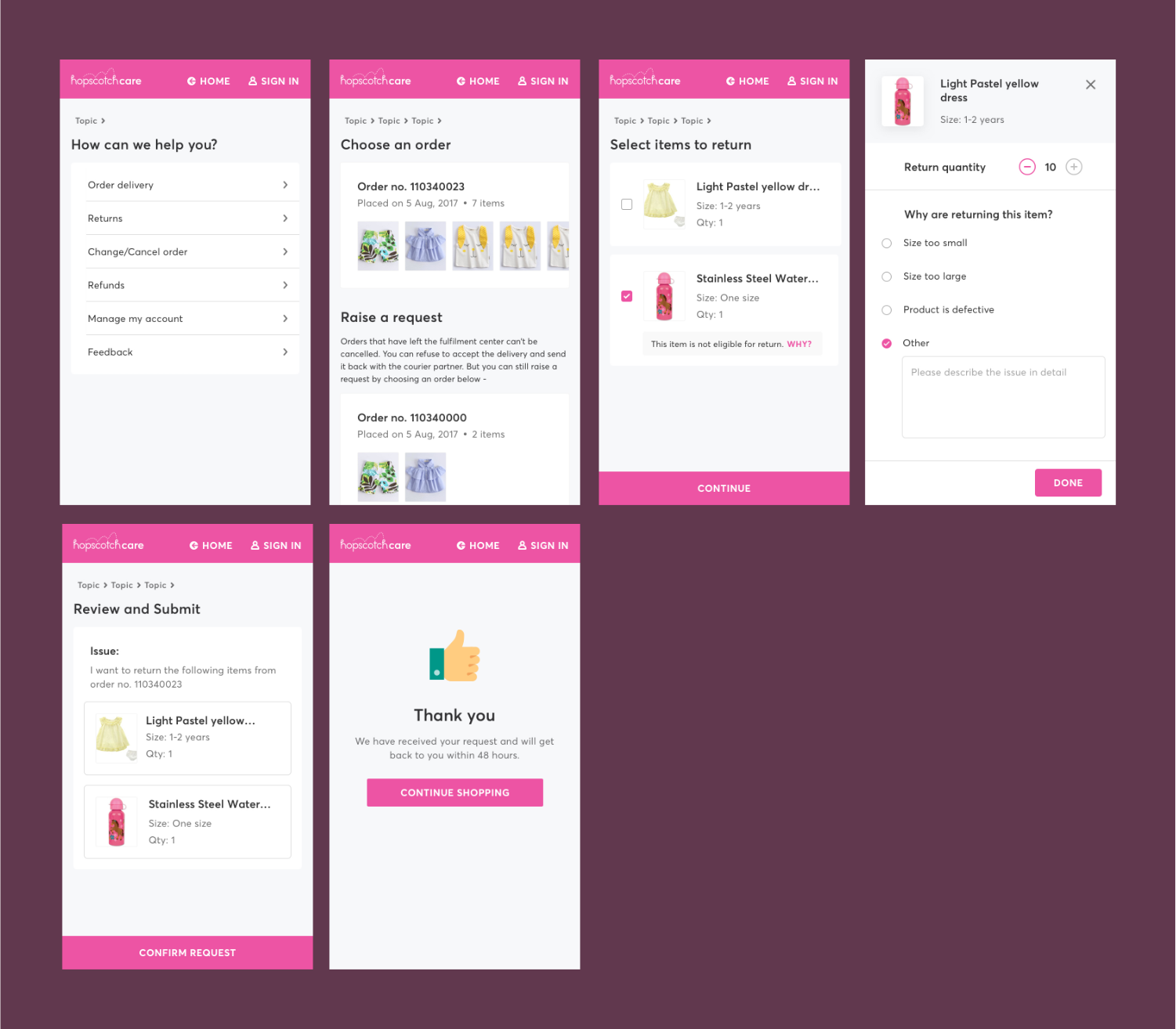
The New Help Centre
The Help section on the app went from being a static page to a complete customer service portal. This was a dramatic improvement in experience and it was a huge project in itself – right from negotiating the product requirements, consulting customer service leads, getting it prioritised and planned and finally creating a comprehensive design solution. Some highlights of the output are shown below.


Another small detail
Besides working to improve the post-order experience, another important touch point for the pre-order cancellation problem was the awareness before placing the order. To address this I suggested a nifty little UI decision for the add to cart experience (progressive disclosure) which brings the delivery date to the customer’s attention when they try to add an item to cart.

View the invsion prototype to understand this better.
The Outcome
It is difficult to estimate exactly how much the redesign contributed to the substantial drop in the order cancellations from 34% to 16% over a 9 month period!
But over this same period, the number of contacts per customer to resolve an order related query came down from an average of 3.4 to 2.2 which can definitely be attributed largely to the product design improvements done over this period.